Monday, April 30, 2018

Heaven only knows where you've been but I don't really need to know I know where you're gonna go

A ETN with an unusual pattern

  (Exchange Traded Note: VXX)

This is a daily chart of a self-eroding Product that behaves beastly in short-term bursts; the VXX has built within it an ability to drop incrementally whether the market spins sideways or if it rises, and as you can tell, the chart took forever to create a temporary bottom.  

This is the bigger picture 


The climactic spikes in VXX were not contained to below 50/ share, what I'm referencing here is the mid range in black, February highs in yellow and the blue dotted line marks the Summer drop in 2017.  All of these levels are attainable

  • The force driving it down at 56.5 (golden line) was the strongest because of the acute nature of the spike
  • The follow-through since February has been tepid, and for that reason we have not experienced that much of a surge through 50 at all, the market needs to go through a phase of settling 
  • One thing that is most clear as far as the action after 1/29 is that VXX holds a strong internal bid above 39.20
Price moving around at the 225 SMA did not indicate a strong reading trend-wise but when you see it from a closer point of view one of the technical conditions becomes more evident.  

Rather than closing below the blue line today it spike higher in a swift fashion.  Also, the pattern I was suggesting with the red and black line makes the inference that the pattern will continue itself; on some level its a three part set up

Price breaks above the 50-SMA (green) and quickly drops below, and it does not take long before it puts in a pin-bottom before making the next move higher 

Sunday, April 29, 2018

Low Pressure and High Pressure Collision

Mirror Opposite

The Opposite Movement of the Financials ETF (FAS)

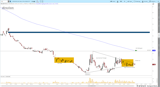
This is a daily chart for the ETF called FAZ.  It moves the inverse of the financials and during times of turmoil it performs very well.  

  • Tendency of mean reversion (ie) the blue zone shaded above has a gap in the mid $16 to 17 range
  • An abnormal head and shoulders  bottom with shaded zones to mark consolidation points
  • A triangle pattern with a good amount of clarity from the top near 13 and all time low at $9.71
  • Shown here 225 moving average coming down into price at 11.08

In percentage terms, a move to 13, or even 20 nearly doubles this "asset" but its not that much of a stretch considering it traded in the hundreds before, and with some pressure from the stock, bond and financial companies having stress, there are some technical reasons why this can trend higher.  

Gap Fill

One of my favorite studies is setting goals around gaps to be filled or perceived "air pockets" that is to say at the 16.50 or higher mark created in September of last year initiated another steady downtrend, and I think that a move to possibly 16.50 is the goal for next few weeks.  

Head and Shoulders Bottom (Inverse)

So we have two examples of consolidation shaded by the yellow zones, the first or left shoulder is when price was confined to 1.5 to 2.5 points before finally having that last slide down to 9.71.  The other yellow zone to the right doesn't have an exit yet, but to validate the pattern it would have to go through 11.78 or do even better to continue the positive momentum started in early February.  

Triangle

Other charts are starting to show similar set-ups, this triangle here is drawn from the peak on 2/5 and that descending trend line and it intersects with the uptrend line from the all time lows, any slight break of this triangle would indicate a change in direction or continuation, time will tell.  

The 225 Simple Moving Average

Tomorrow and next week the SMA will continue going down to catch up with price, but it would be interesting to see how long that does take, in February of this year the Average True Range of this ETF was within 1.48 so it won't take that much time for it to get to a 13.48 target.  


Monetary policy, the state of our government, and how the Bond market trades will all weigh on the conditions for the financials, this May until November should be fun and interesting times to trade, and when there is a crisis there is an opportunity.  

Saturday, April 28, 2018

Euro's Fib Relationship, the dispute over 1.21 and Neutralizing

The Dollar Surge and the Aftermath

This is a daily chart of the EUR/USD pair that focuses in on the short entry (average) above 1.2350 and measures the height of the move set in this month and includes the lows of Friday's trading session

Temporarily EUR/USD bullish just on the depth of the oversold conditions


Typically fibonacci numbers can be used to retrace a dominant move and determine references for how much it can retrace its footsteps.  Here's what I mean, EUR/USD traded at 1.24737 at its relative peak at the left side of the chart.  And we measured the range and placed the bottom end of the fibonacci tool to the bottom at 1.20587 and so for the 425 pips the pair dropped, each level indicated in between the candles goes from 23.6%, 38.2%, 50% and 61.8%

Although there is no guarantee that price will move back up to the 50% retracement at 1.22173 the 50% has been reliable as a technical principle.  

Now since we are short EUR/USD if the pair continues rising the short position becomes worth less and we give up gains, so I decided to balance the trade to hedge against the prospect of giving up gains.  

I see some value in AUD/USD and that would be a good hedge and for now possibly a good time to be long.  The long position is set with one entry for now at 0.75551.  There are some very heavy resist points at 0.78 and I don't have that much faith in it, but anything is possible, if there is a need to lock in gains, it will be because of a consolidation phase and then the next turn down.  


So what I will leave you with here is my perception of the dollar index showing some early stages of a mini-top, there is a topping tail that is showing bigger sellers, and evidence that institutions are getting out for the time being and for that reason a hedge would be logical for traders with pro-dollar positions especially if they are held overnight


Friday, April 27, 2018

God's Plan

SPY 4 Hour Chart 

The Logic of Moving Averages


  • 50 and 225 Moving Average Crosses both Positive and Negative
  • Lack of Uptrend 
  • Price being Denied by Slower and Faster Moving Averages
  • Change in Momentum after two rejections

(1) The 50 crossed through the 225 in a positive way, but then failed after price spend 1 day deliberating and then tanked leading price in a direction below the 50 period moving average and point 1 marks where price did not exceed the green slope shortly after the crossover

(2) In the congestion circle price briefly tapped the 225 blue sloping line and then departed very quickly 

(3) The reaction to much lower prices at 260 ramped price back into 264 which was quickly rejected and then brought us to the base between 256-258, most of the demand was below (3) and led to the generation of the trendline

Terminated
  • Trend line was broken and it happened at relatively the same levels as the congestion circle to the left side between 269-272.50
First Rejection
  • The 50 and 225 period moving averages coiled together and left the level very quickly, this confirms the power of the downtrend
Second Rejection
  • The same scenario is taking place but the difference is that it lacks as much positive momentum and that is why the 50 period green moving average is already on its descent before price entered 266.55-267

Thursday, April 26, 2018

Mid-Range Yet Direction Stands


ES Futures Trend Check

  • Trendline Capturing Most of Price Action and Wave Direction
  • Targets Reset to Lower Point - Digging for Gold in Supportive Structures
  • Placing Lower Highs in their Context
  • When Lower Lows become Murky
  • Alternative Views

In some technical analysis circles trendlines whether going up or down tend to capture 3-points of touch.  In our case here, there are 4, and I placed the angle starting from Jan 29th 2018 to line up directly with the highs printed for today.  It acts very well in terms of following the downward slope, and I admit I'm not trying to angle my point of view to fit my interests in getting cheaper asset prices, it just fits.

The first oval marks where the lows from the prior trend were completely undercut.  The second yellow shaded oval marks where the prior lows from February to March were undercut.  Now, price started going higher each time a low was put in, which gives the bulls an argument, however more of the interim-tops are being sold with just as much or more force than the pressure buying them.  

There are many competing viewpoints

This makes conditions uncertain, because it doesn't trend in such a clean and even fashion it makes the waters murky because if there are more attempts at resuming the uptrend price would reflect a pattern that wants to reach new highs, or at least push toward the high end of the range whether its 2800 or 2875, there are plenty of bulls in the marketplace who would love to get closer to their annual goals of 12% growth this year.  

In another view a symmetrical triangle can be surmised just from connecting the high and low points, but in the end with further confirmation of this downtrend these past 2 months will probably be seen as the consolidation before the big breakout to the downside, that is the bearish point of view.  

Below you'll see the break point in October of last year with two levels at $2485.61 and $2497.12  we are watching those with great interest, from today's close that would only be a mild 7% correction, so its not that unrealistic.  

Wednesday, April 25, 2018

Nasdaq advances with run-away gaps

Nasdaq Index Set-Up
Buy the dip and sell the rip

  • The Rare condition of gaps in the futures markets
  • The Targeted Level was hit
  • Consolidations in Bear Markets
  • Trend Resumption
What you see toward the right edge of the chart are two gaps shaded in the yellow ovals, they mark points of imbalance where price will have a tendency of filling (we have back-tested this idea numerous times) it is something to expect from the not as liquid nature of common stocks but futures have proven to fill more often and in most cases in the same day

The arrow on the left edge shows the point of pain where price jumped into 6612 before cratering and resuming the trend of lower lows.  This was nearly the exact same point where buyers showed temporary exhaustion and were not able to keep bidding.

In trending markets bears or in our case the dominant sellers must pause before they can make the next move, and that is a consolidation between 6440-6600 its a wide and loose base (for these conditions entering May we would say building a top between both points at 6600-6615

This is the kind of stalling that we would expect before a charge toward yearly lows and whatever unexpected news comes down the pipeline.  Also on a side note, the yield on government bonds is creating a fundamental headwind making stocks less attractive, so the psychological element of increase pessimism makes it hard for the buyers to show as much enthusiasm on good news releases as they used to in recent quarters.  

We should look-over this chart after the set up has either fulfilled its goal of coming down 400-500 points or see why it would have been invalidated technically....

Thank you 

Saturday, April 21, 2018

Remember to Take Your Vitamins

The Vitamin Shoppe Inc.  

With very good risk management skills managing a trade in VSI can be very profitable if you can keep a long position with a stop loss at 2.85, I honestly don't know if this company is a zero in terms of its perceived future cash flows and what type of forward earnings guidance they can give.  

The Risk-to-Reward illustrated here is about a 10-1, however risk must be respected, because the company never traded at $2.95 in its whole history.  

Will they be in the graveyard of all the retail companies going out of business when people want to spend money on their health?

Some charts are technically so damaged that there is something fundamental about a company which cannot be ignored.  In this case here, operating revenue, ROI, a troublesome debt burden

But with so many fundamental traders focusing on EPS, they are losing sight of the big picture psychologically and that in technical terms VSI is a deep value proposition waiting to go higher 

The monthly chart here is illustrating how many more "green" months have been forming in spite of many years of almost an 80% chance of it going down

I chose to put on an exponential moving average (shaded in green) to point out that we are in the late stage of a base which is ready to launch this into a multiple percentage term increase, 20% 50% 200% I don't know exactly how much it can retrace higher.  So if fibonacci's are a good guide, we'll be able to realize as much as a 23.6%  to take price to $17.82, I admit its a stretch but in my plans this won't be a long term hold or even have an interest in keeping this for a yield

Technically I believe its a good set up for its base, price and volume dynamic, and the tendency for stocks to revert back to their mean, the company averaged a price in the double digits, and it could be a very nice value for someone brave enough and coded enough to manage risk in a challenging trading environment. 

Wednesday, April 18, 2018

Bitcoin Possibilities

Bitcoin at $10,000 in US-Dollar terms is not that much of a stretch
*Trendline - 3-4 points of touch, goes back to where BTC futures came out at 20,650 the financial institutions shorting this got a big reward, in recent days it was violated which is bullish
*Aggregation: it took some time for BTC futures to have a 50-period simple moving average, the blue arrow denotes when it happened 3/1 was when it started displaying a slope for the MA; price is still below which means this part of the short term trend is down, with enough energy it can possibly close above, making it bullish long enough to matter
*Base of aggressive buyers, 5970 was the low for this time (not an all time low) but the 6,000 or 7,000 held well enough for whoever the buyer was to dictate all of the demand
*10,000 goal..........its mid range, maybe not a 50% fib retracement but a nice target even if you were long 1 or 2 bitcoins it would make a difference
Technicals mixed with higher adoption rates and more applications would be constructive for this asset-class
-DR

Profits on BABA

From the last post on this trade we were looking at the potential for BABA to run to $185 or greater, which was the shaded yellow zone near the 50 -period moving average

The goal is nearly achieved.  But because its waning momentum I would think we are close enough to take profits. 

The origin of this sell-off from 4/3/2018 came in at maybe 0.05 to 0.25 from current price and that leads me to believe that the run could be in for a pullback, but if it goes even higher we can always move up the stop and close the position gradually. 

Sunday, April 15, 2018

The Bigger Range in EUR/USD

Today we are going over some of the notes on this EUR/USD chart and the potential for a bearish continuation

The bigger green zone along the bottom of the price action created from the end of October last year to Mid-Novemeber was where most of the aggressive buyers came in to drive price higher @1.156 to 1.17

The sell zone above in yellow ranged between 1.25 and 1.235.  The size of each area is similar because it spans between 250 and 300 points

I have on here the 50 period simple moving average to indicate trend, and on the chart the first few times price broke above the 50 SMA confirmed and then retested support.  Price flew higher for several weeks until crashing into 1.25

At 1.0 - Price retested the moving average which acted supportive

At 2.0 - Price consolidated above and below with several closes in both directions, before ultimate break out above which fizzled quickly @ 1.2450

At 3.0 the series of lower highs is beginning to set in where the market is trying to create newer lows, price also is starting to flirt with the 50 SMA and possibly close below to confirm bearish sentiment


Friday, April 13, 2018

The Shift


The ground that I wanted to cover today is when a trend changes state, and where to determine reversals and continuations
  • Charting involves adjusting for a higher low, but possibly 10-15 points higher
  • Is the market neutral for the year, sell trigger?
  • 1 hour time interval covers one month
  • The change in market state to a more bullish tone
  • Violations of a upward moving trendline and what the moving average is telling us
When newer highs are formed, I often remove the previous high and it no longer is relevant to that state of the trend.  In our case here, look at the shaded oval in green, it was a high, in a series of other highs that were formed, which were higher than the previous highs; the pattern is very clear

On the other hand, in this micro view (1 hour chart) it would seem like price is chopping around before resuming the uptrend, but at precisely the highs of today the market was just about unchanged for the year, and then in the final two hours the sell-off intensified wiping out the days gains.  Is it a sell trigger, there is a possibility  2662 to 2678 were really tough to hold (keep higher) and there is plenty of volume to go along with the selling pressure. 

One month:  Since 3/11 most of the selling was triggered at or below the moving average until it bottomed out between 4/1 and 4/2


The trendline, although loose, is still pointing higher, but price cut through it in a very aggressive fashion.  The moving average on the one hour chart is not saying much of any type of up or down trend, its just chopping around, but on the daily it paints a different picture.


Volume is increasing on a bearish day, and there is an intense rejection of the highs today right within close distance of the 50 period moving average on the daily chart. 


Wednesday, April 11, 2018

The 50% Pullback

I bring to the table points of view for both selling short and going long, the buy the dip mentality has maybe been shaped from the hundreds if not thousands of times stocks go up from competition over asset prices.

I am breaking down some points of interest with Facebook shares FB from the low of $72 to the all time high of $195.32

I believe the trend is down and that shares are going from expensive to cheap. 

How low can it go?

Why should there be a shorting opportunity, and is there deep value somewhere?
  • Headline news pressure, Zuckerburg in the news brings to light some of the risks the company faces
  • The fibonacci tool, marking the $136.66 the fair middle ground
  • The magnitude of this move was 123 points and thats how far it ran
  • The stock went up 171.28% and that was just since October of 2016
  • Moving averages:  The 50 period simple moving average, and the slower sloping 225 period
  • Former resistance becomes support 
From countless frames of experience I have seen the 50% retracement get touched whether its a bullish scenario and prices are ramping up off low prices.  I have also seen several tops eventually roll over, and rest at a 50% fibonacci retracement which is perceived as a deep value proposition.  

Price is below both moving averages:  the 50 and the 225, there is a gap above and I see that as a risk for shorts, that is to say that the gap could be filled at 175-178, but who knows really?

The other aspect of the darker blue 50-simple moving average is that it is pointing down so aggressively I take that as the sharpest indication of trend direction.  

So hitting a 50% pullback of this entire MONSTER move would account for 61.16 points of movement out of something which went up 123 points, its attainable even though it would look like a big stretch now.

At about 10/24/2016 shares of FB really hit a roadblock and that resist point should act as support if the force of the downtrend is powerful enough to bring us to $133.66


Tuesday, April 10, 2018

1/2 hour and the big picture

The swings in the S&P 500 are clear on this 30 minute chart.

Here are some of the technical points


  • Supportive and Resistant Points/Boxes
  • 50 Simple Moving Average
  • Neither higher highs nor lower lows "locked"
  • A trendline that is neither too tight or too loose


I set this chart to have buyers in the shaded regions in green and blue.  The more aggressive buyers came in the approximate 2560, and then the ones with less force "weaker hands" came in to drive prices up out of the 2580-90 territory in blue.

The yellow 50 simple moving average is as confused as this range, with a low of 2550 and high of 2670 the signal of price crossing through each time signaled bull or bear fairly accurately.

When we compare the chart from earlier in the week we can see that I started coloring HIGHER LOWS in blue and more are beginning to appear.

As the bears would interpret this chart, the lower highs coming in are also following a similar pattern, so its still a tug-of-war

Now, the slope of this trendline in black is subject to review because they can be broken quickly, and the other is the angle, it has 3 points of touch, and for the most part captures trend, but as I type price is right at 2642 which can mean any offering would drive it down and as a result invalidate the trendline.

It would seem really convenient to place a trendline and then at the moment you place it, it breaks, leading to a bearish resolution, but we can't plan or influence these things to happen.

Trade well!


Monday, April 9, 2018

Triple Screen Analysis on BABA

So this is meant to be more of a thought experiment

Let's take a look at this post in a few days, BABA is trading down relatively, on the week, and even this week so far has shaped up to be mediocre. Because of today's and this week's action, I suspect that a technical bounce would come off the 50 period simple moving average here on this first chart, it may even reclaim 175-177 when the market opens again

It trades up because of the Chinese comments. One set up in a resist point that will reveal itself tomorrow, but its fair to price in about a 2% bounce

I need to see how this pans out.

This is a weekly chart.


This is the daily chart with the zone where I anticipate it to trade (ADRs trade during American trading hours) it is also in line with the 50 simple moving average; and a great alignment of the two price points


Lastly we have the 4 hour chart


Its definitely primed to overcome the 50-period simple MA, and from this point of view, it would look like a gap up into the over head resistance area between 180 or higher could spell trouble if it doesn't hold and close above that hurdle 

Overnight gaps exaggerate and tend to burn out quickly in bear markets, the phase we are in is crucial now because we can either reverse and go higher or continue the moves down, which technically BABA is deeply oversold but for now I thought I would keep the momentum going in terms of showcasing bullish set ups that have a strong chance of working .   

Sunday, April 8, 2018

S&P 500 - 30 mins

April 8th 2018

The part of this chart that jumps out most to me is the two blue underlying arrows for our recent 2 days of trading.  This is an appealing idea for whoever has a bullish bias, but little did some traders realize that on the way down, all the green arrows were like traps, getting people to add to a problem, that is to think you've called the precise low; but I feel with my experience false bottoms are more subtle.

One, I changed their color to entertain the idea that there could be a series of higher lows coming, and that being the next two "mini-bottoms" could buck a new uptrend on this time frame.

On the other hand, we are not sure of any follow through coming in from Friday's awesome sell-off.  Normally I can understand that a Fed announcement from Powell and a negative reaction on the day to jobs numbers would lead to some type of continuation the next day and week, especially for such heavy news items.

But as always, the future is not our to see, and I kept on the ????

The most powerful part of this chart is the 50 simple moving average shaded in yellow.  It is a beautiful marker of trend and as of the past month price has acted very well at following its downward pointing slope.  It was frustrating in 2017 to have such a gangbuster rally without much reversion to mean, and from my point of view it was harder to gauge when the pullback would happen.  We can always later on experiment with different types of moving averages like exponential and simple and see which ones on the daily revert to mean more frequently. 

This should be an exciting segway into the mid-April to May trading environment!